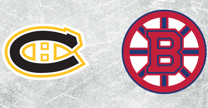
Bruins-Canadiens color swap has both fan bases cringing
Share
Fans of the Boston Bruins and Montreal Canadiens rarely agree on anything.
Ask them who the greatest player of all time and you’ll get a range of answers from Bobby Orr to Maurice “Rocket” Richard. Ask them which beer tastes better and the answers will range from Sam Adams to Molson. Ask them which color is better, well, that one is simple: either the Black and Gold or the Red and Blue.
Well, there’s something that both fan bases can agree upon and that neither logo would look good if they were to swap colors. That’s exactly what graphic artist Brian Coursen did.
In a post on Reddit, Coursen found a way to dig at both fan bases with the color swap. The users response ranges from flat out being nauseated to having their day ruined.
In the first, and hopefully, only time, here is the picture of the Spoked B in the colors of the Bleu Blanc Rouge, and the Habs crested CH logo in Black and Gold:
This wasn’t the only color swap from Coursen. Also included in his collection are the Rangers logo in Devils colors, the Flyers logo represented in the colors of their hated rivals, the Penguins, and more.
Thankfully, this is the first, and probably only time, we’ll see the logos of these two Orginal Six rivals go through a change in the way they look. This chapter of the Bruins-Habs matchup should never exist again as far as your’s truly is concerned.
Hat tip: CBS Boston


